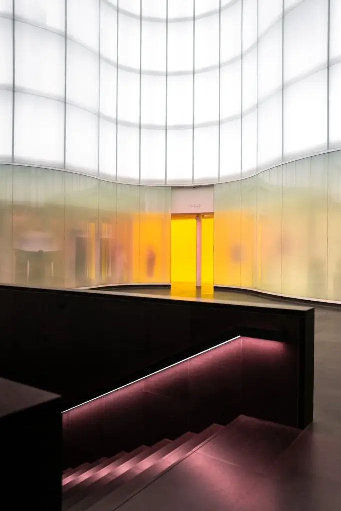
Consider 2200–2700K for evening ease, reserving 3000K for kitchens or desks where alertness matters but softness still counts. Test at night, not noon, because adaptation shifts perception. Mix sparingly within one view, allowing one temperature family to lead while others recede politely.
High CRI or TM-30 values prevent washed complexions and dulled woods. Seek balanced R9 saturation for lifelike reds, and verify how fabrics, food, and artworks behave under sample light. Honest rendering supports quiet luxury, proving restraint does not mean lifeless color or flattened texture.
Combine lamps, coves, and pendants by coordinating temperature, dimming curves, and diffuser character. Avoid abrupt color shifts that fracture mood. If blending is necessary, let warmer pieces sit at eye level while cooler task lighting stays peripheral, so emotional warmth remains centered.
All Rights Reserved.